Combo Box Control
About combo boxes

In MRI Dreamscape, a combo box provides the features of a drop-down list.
- You can customise the initial appearance.
- You can populate the selection options manually, or by binding to a data object.
- When a selection is made, you can trigger a JavaScript function, workflow, or a web service.
- FSI API methods can be used to retrieve or set the selection value.
Customising initial appearance
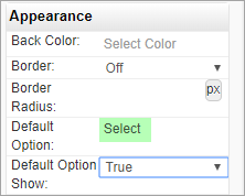
In addition to the usual parameters (colours, size, and so on), you can also define what will display in the combo box will initially.
- When Properties > Appearance > Default Option Show is False, the combo box displays the first item in its selection list.
- When set to True, the text set in Properties > Appearance > Default Option is displayed which is Select by default, but may be edited.

Populating the options list manually
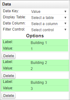
When you configure the combo box options manually, you assign Label - Value pairs.
- When the Data Key property in Properties > Data is set to Text, the combo box returns the value of Label for the selected option.
- When the Data Key property in Properties > Data is set to Value, the combo box returns the value of Value for the selected option.
To configure the combo box selections manually:
- In Properties > Data, set Data Key to Text or Value.
- Configure Label - Value pairs in Properties > Data > Options.

Populating the options list from a data object
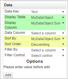
When you configure the combo box selection list using a data object, you bind the control to a data object and a column in it to provide the selections that the user can choose from.
- When the Data Key property in Properties > Data is set to Text, the combo box returns the value of the data object column for the selected option.
- When the Data Key property in Properties > Data is set to Value, the combo box returns the SystemID of the data object row for the selected option.
To populate the combo box selections from a data object:
- In Properties > Data, set Data Key to Text or Value.
- In Display Table, select the data object that will provide the selections.
- In Display Column, select the column that will be used to populate the selections.
- Optionally set the sort parameters, Sort By and Sort Order to sort the selections order.
- You can also filter the selections based on the value of any column in the data object; select the column in Filter By, and choose a control that will provide the filter value from Filter Control. The filter must provide an absolute match, not partial.

On change
A combo box may be configured to execute a workflow, JavaScript function, or a web service when its value is changed. You define this in the On Change property in Behaviour.
FSI API JavaScript methods
For details of FSI API JavaScript methods for combo boxes, see FSI API: Combo box.