Data List Control
About data lists
A data list, like a grid, is a web control bound to a data object that renders each data object row in an HTML table. The topic Grid versus Data List Control highlights the main differences between data lists and grids.
Appearance properties
Use the Appearance properties to customise the fonts, colours, borders, title, header and footer of a data list. You can change the appearance of alternate rows in the Alternate section.
Populating data lists
Data lists may be populated in these ways:
- Automatically when the page loads.
- Using a workflow.
The FSI JavaScript API provides methods to show or hide the row count, refresh the data, and set filters; see FSI API: Data list.
Populating a data list when the page loads
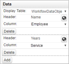
You can bind a data list directly to a data object, and in this case you configure the columns to be displayed. The data list is automatically populated when the page loads.
In the Data properties for the data list you select the data object from the Display Table list, and then configure each column you want displayed with the Header name and the corresponding data object Column.
Populating a data list from workflow output
Using this method, the workflow output is directed to the data list; the data list columns and headings are set automatically by the workflow. For a simple implementation using the system defaults for appearance, filters, formatting and so on, there is no other configuration needed for the data list.
Setting the workflow output
A data list (and a grid) expects a JSON string from a workflow output.
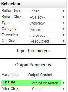
You can trigger the workflow in a number of ways; from a button, when the page loads, or from the FSI JavaScript API. The important point is to set the workflow Output Parameter to bind to the data list control.
When the workflow is executed by a button, the button Behaviour properties will include an Output Parameters section where you specify the control that workflow output will be directed to:
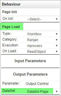
Similarly, when the workflow is executed by a page event (for example, Page Load), the event Behaviour properties will include an Output Parameters section where you specify the control that workflow output will be directed to. This example shows a workflow with no inputs which is executed when the page loads.
Data properties
For Display Table properties, see Populating a data list when the page loads above.
Progressive Loading: Set this parameter On for data objects that return large numbers of rows. You can then control how rows are loaded using the Step and Limit parameters.
Page Document and Document Label: If the data object is used for storing document links, you can display a column showing the number of documents in each link. Page Document must be set to Show, and the additional column takes it's name from Document Label. See also: Document Linker Control.
Sort By and Sort Order: Use these properties to sort the data list display; you can sort by a column that isn't being displayed.
Behaviour properties
Use the Type and On Click properties to run a workflow, JavaScript function, or web service when a user clicks any row in the data list
Use Redirect URL to redirect to another page in the web application or to an external URL when a user clicks a row in the data list. When redirect is to a another page in the web application (Internal URL), the SystemId of the selected data list row will be available in the new page, and may be returned using fsi.getDataKey() in the page JavaScript. If the new page is bound to the same data object in the page Layout, then the data in the selected row will be available to controls in the new page.
Filters
You apply a filter to a data list based on the value of a particular Column. The Condition parameter specifies the comparison operator; greater than, equals to, and so on.
A Control, for example a text box, is selected to provide the filter value, and you can optionally set the initial value using the Static Value parameter.
In use, when you change the filter value in the control and then click anywhere outside the control, the data list automatically refreshes to show the new filter results.
Formatting
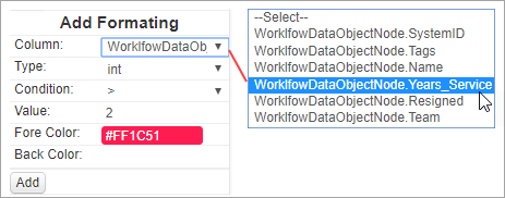
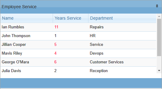
Formatting can be applied to a column to change a cell's appearance based on its value. This formatting example displays cells in the column Years Service in red when the value is greater than 2 years.
Images
When you display a data object VARBINARY column containing an image, a data list displays an image Download link.