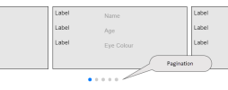
Swiper Control
Swiper is a touch slider which is best suited to web apps on touch-screen mobile devices. This topic explains how to configure a swiper using the drag-and-drop control found in the Controls Layout section. To configure a swiper using only JavaScript, see JavaScript Swiper.
Operation
When you drag and drop a swiper onto a page, a swiper outer container is displayed holding a slide template. The initial appearance uses vertical navigation with arrows like this:
The slide template is customised by adding one or more controls to it; you can add container controls to group other controls together inside the slide template. To populate the controls in the slide template, you can either:
- select a workflow whose output can be assigned to controls in the slide.
- bind the swiper to a data object. The data object fields can then be assigned to controls in the slide; for example, text boxes. Each row in the data object will populate a new slide.
This screenshot shows how a data object could be used to populate slides in a vertical swiper—
Appearance properties
To customise the swiper's appearance, you set Appearance properties on the swiper container, slide template, and the container and controls added to the slide template. You can also apply CSS styling using the web app Global CSS.
Data properties
Data properties are used to populate the swiper using a data object or workflow.
Populating a slider with a data object
- Select the swiper outer container. In Data properties, select Type as Data Object and then select the data object (table).
- For each control in the slide template, in Data properties, set the Data Column to the appropriate field in the data object.
Populating a slider with a workflow
Not supported at the time of writing:
- Select the swiper outer container. In Data properties, select Type as Workflow and then select the Category that the workflow belongs to.
- Select the workflow from the On Render list.
- In the Output Parameters section, bind each control in the slide template to the appropriate Data Set or JSON data item.
You can also use JavaScript to execute a workflow and populate a swiper; see Populating swiper slides in FSI API: Swiper
Behaviour
- On render: Executes the selected JavaScript function when the swiper has finished rendering all the slides.
- Slides Per View: The number of slides visible in the swiper at any time.
- Progressive loading: This option is useful when there are a large number of slides, or complex slides in the swiper. When true, the swiper is visible as each slide is loaded to the swiper view. When false, the swiper remains hidden until all the slides are loaded.
- Slide Count:
Options
Options properties are only visible when the swiper outer container is selected.
- Swiper Direction: horizontal or vertical.
- Transition Effect: Slide, Fade, Cube, Coverflow.
- Transition Speed: Duration of transition between slides (millisecs).
- Space Between Slides: Distance between slides (pixels).
- Keyboard Control: When true, enables navigation through the slides using the keyboard.
- Mousewheel Control: When true, enables navigation through slides using mouse wheel.
- Show Grab Cursor: This option improves desktop usability. If true, user will see the "grab" cursor
 when hovering over the swiper.
 - Slide Offset: Adds additional slide offset (px) in the beginning of the container (before all slides) and in the end of the container (after all slides).
- Overlay Navigation:
- Navigation Always On:
- Hide Nav when locked: Hides navigation components when the swiper is locked.
Navigation
- Lock Swiper:
- Free Mode: If true then slides will not have fixed positions.
- Loop Slides: Set to true to enable continuous loop mode.
- Enable Scrollbar: Set to true to enable scrollbar navigation.
- Scrollbar color: Scrollbar colour.
- Handle Color:
- Scrollbar Draggable: Set to true to make scrollbar draggable—allows you to control slider position.
- Snap to Slide: Set to true to enable snap to slides positions in free mode.
- Enable Pagination: Displays the position of the current slide amongst the other slides; for example,

- Enable Nav Arrows: Set to true to enable navigation arrows.
- Nav Arrow Color: Navigation arrows colour.

