Text Box Control
About text boxes
A text box always displays text in one line, without wrapping; use a text box for small amounts of text.
For larger amounts of text use a text area, which wraps text to fit the available window size.
Label and placeholder

In the Appearance properties:
You set the text box label in the Label > Default Value properties.
You set the placeholder text in the Placeholder property.
Control type
The Control Type property in Appearance defines the basic text box behaviour:
Text: (default) For general text entry.
Password: Characters typed are shown as stars, hiding password details.
Email: The system checks that the text entered is in email format and displays a system message on error:

Populating a text box
A text box takes can take its input from:
- a user: The user types into the text box. You can apply validation to the text; see "Input validation" below.
- a data object: The control is bound to a data object column using the Data Column property, see Controls and Data Objects.
- from JavaScript: You can use the FSI JavaScript API method: fsi.setById() to set the value of a text box. See FSI API: General methods for controls.
- a workflow: When you configure a button to execute a workflow, you can specify a text box (and some other controls) to display the output. This is set in the button's Output Parameters property in Behaviour.
Behaviour properties
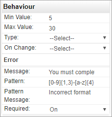
When a Save, or Validate button is clicked on a page, or an fsi.saveForm() JavaScript method is called, the system validates the text box value against any validation rules that have been set. These rules are configured in the text box Properties > Behaviour section, for example:

Text length
The Min Value and Max Value properties in Behaviour set the minimum and maximum number of characters allowed in the text box. Max Value cannot be less than the length of the Default Value property in Data. When too few characters are entered, a system message is displayed below the text box. If Message has not been set, a system message is displayed.

Mandatory input
Required: Set this to On to force input into the text box; when there is no input, the text in Message is displayed below the text box, for example:

Pattern matching
Pattern: Type a regex (regular expression) string for pattern matching against the text box contents. For example, the string below would enforce input of 1, or 2, or 3 numbers followed by '-' followed by 4 capital alpha characters.
[0-9]{1,3}-[A-Z]{4}
When mismatched, the text set in Pattern Message is displayed. If Pattern Message has not been set, a system message is displayed.

On change
A text box may be configured to execute a workflow, JavaScript function, or a web service when its value is changed. You define this in the On Change property in Behaviour.
Using the data in a text box
You can use the value entered into a text box:
- To update a data object when the page is saved. The control is bound to a data object column using the Data Column property, see Controls and Data Objects.
- To provide an input parameter for a workflow executed by a button. This is set in the button's Input Parameters property in Behaviour.
- With JavaScript—by returning the value using the FSI JavaScript API method: fsi.getById(). See FSI API: General methods for controls.