FSI API: Alerts
This topic describes basic use of the alert message popup invoked by fsi.alert().
The tutorial Alert Content Using HTML DOM provides an example of using an HTML DOM element to customise an alert for user input.
Showing an alert popup
An alert is customised by passing arguments to fsi.alert() as an array parameter object like this:
fsi.alert({title: <title>, text: <message>, icon: <icon>}); Displays an alert popup.
Note | Do not use the non-object way of defining options: fsi.alert(<title>, <message>, <icon>), which does not work reliably.
Four default icons are available by setting the value of icon to info, warning, error, or success. Note that these values are case-sensitive.
Examples
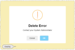
This simple example displays the alert message popup shown below. The Confirm (OK) button is a default button displayed when no buttons are specified in the configuration.
fsi.alert({
      title: "Delete Error",
      text: "Contact your System Administrator",
      icon: "warning"
      });
To change the default Confirm button text (OK), add a button option:
fsi.alert({
      title: "Delete Error",
      text: "Contact your System Administrator",
      icon: "warning",
      button: "Got it"
      });
To remove all buttons from an alert, add an option, buttons: false like this:
fsi.alert({
      title: "Delete Error",
      text: "Contact your System Administrator",
      icon: "warning",
      buttons: false
      });
Custom buttons
Custom buttons are defined in an array object; you set the identity, text and activated value for each button.
This example displays an alert popup with custom Yes and No buttons; when a button is clicked, its value is tested and appropriate action taken.
 function test(){
    fsi.alert({
      title: "Delete Setting",
      text: "Are you sure you want to delete this setting?",
      icon: 'warning',
      buttons: {
        Yes: { text: 'Yes', value: 'Yes' },
        No: { text: 'No', value: 'No' }
      }
    })
    .then(function (value) {
      if (value === "Yes") {
       fsi.alert('YES clicked');
      }
      else{
      fsi.alert('Cancelled');
      }
    });
}
Configuration options
Some commonly-used options:
timer: <mSec> —closes the alert popup after the value in milliseconds.
closeOnEsc: false —prevents the user dismissing the alert popup by pressing the ESC key. Default is true.
closeOnClickOutside: false —prevents the user dismissing the alert popup by clicking outside of it. Default is true.
For example:
fsi.alert({
   title: "Delete Error",
   text: "Contact your System Administrator",
   icon: "warning",
   closeOnEsc: false,
   closeOnClickOutside: false
   });
Closing an alert popup
In a simple alert, the Confirm button closes the alert popup. By default, an alert popup can also be closed by pressing the ESC key, or clicking anywhere outside of the alert; these actions may be blocked individually; see Configurations options earlier in this topic.
In more complex alerts, you may want to close the current alert with JavaScript code; in this case you can use the method: swal.close, which is part of the Sweet Alert (swal) library.
Note |/*global swal*/ must be placed at the top of the script, before any code, and is not a comment; it allows validation to succeed when the swal open source library is being used. It could also be placed at the top of the web app's Global JavaScript and would then be effective for all pages in the app.
Example
/*global swal*/
function closeAlert() {
 //some code
  swal.close();
 //some code
}
CSS theming
You can customise the appearance of alert popups by adding .swal classes to the web app Global CSS. Some commonly used classes are listed below.
Note | Web browsers cache CSS files; you will need to clear the cache to see CSS changes that you make. Ctrl + F5 will work on most web browsers; you may have to use it twice under some circumstances.
.swal-modal
Customises the default alert popup appearance; the CSS code uses the rgba() function to define the colour and the alpha channel (opacity).
.swal-modal {
  background-color: rgba(145,195,238,0.39);
  border: 3px solid black;
}
.swal-overlay
Fills the background surrounding the alert popup with the specified colour. You can use this to grey out the rest of the screen, using the alpha channel parameter to set the opacity.
.swal-overlay {
  background-color: rgba(240,222,110,0.5);
}
.swal-button
Customises the appearance of all the alert buttons. There are additional sub-classes you can use to target a particular button in the format, swal-button--{type}; for example, to target the Confirm button, use swal-button--confirm.
.swal-button--confirm {
  padding: 7px 19px;
  border-radius: 2px;
  background-color: #4962B3;
  font-size: 12px;
  border: 1px solid #3e549a;
  text-shadow: 0px -1px 0px rgba(0, 0, 0, 0.3);
}
.swal-button:active
This selector changes the colour of a clicked button (until the popup closes), providing confirmation to the user.
.swal-button:active {
    background-color: #ff0000;
}
.swal-title
Customises the appearance of the alert title.
.swal-title {
margin: 0px;
  font-size: 16px;
  box-shadow: 0px 1px 1px rgba(0, 0, 0, 0.21);
  margin-bottom: 28px;
}
.swal-text
Customises the appearance of the alert message text.
.swal-text {
  background-color: #FEFAE3;
  padding: 17px;
  border: 1px solid #F0E1A1;
  display: block;
  margin: 22px;
  text-align: center;
  color: #61534e;
}
.swal-footer
Customises the appearance of the alert footer.
.swal-footer {
  background-color: rgb(245, 248, 250);
  margin-top: 32px;
  border-top: 1px solid #E9EEF1;
  overflow: hidden;
}
.swal-icon
Customises the appearance of all icon types. There are additional sub-classes you can use to target a particular icon, in the format, swal-icon--{type}; for example, to target the info icon, use swal-icon--info.
.swal-icon--info {
  background-color: #000000;
  border-color: #ff0000;
}


