Page Layout Properties
When a new page is created, it appears in the page designer with an empty layout. You can click inside the layout area to select the Layout, or choose Layout from the drop-down list above the Properties list—Layout its always last in the list. The Properties list is empty until you select a control or the Layout.
The layout Properties are grouped in sections—Appearance, Data, Behaviour, Page Parameters, Page Navigation, and Mobile Page Header. The Properties sections are described below.
Layout appearance
Options in the first section of the layout properties set the page background colour, theme, and background image. Themes also set a background colour, which is active when no background colour has been set. Selecting an image for a background, overrides any background colour.
The next two sections set margins and padding for the displayed web page content relative to the page viewport between the header and footer. Changes to padding are seen in the page designer; changes to margins are not.
Language translations
Translations can be applied to text in the layout where you see the Translate button ![]() . For more details see Using Languages Tutorial and Configuring a Web Application Version.
. For more details see Using Languages Tutorial and Configuring a Web Application Version.
Data
A page can be bound to a data object that you want to read from or write to; you can then bind fields in the specified data object to certain controls; for example, data list, image panel, text box, check box, and so on.
See also Controls and Data Objects, and the tutorial Events Diary Tutorial.
Behaviour
These options can be used to trigger workflows or web services, or call JavaScript functions on certain page events; for example, page load, page scroll, page click, and so on. By convention, but not mandatory, a JavaScript function that is called when the page loads is named onLoad.
Page parameters
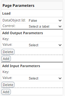
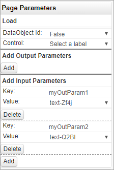
You can add page parameters as key-value pairs to a page in your web application; these parameters are made available to another page when you navigate to it. They can also be set, retrieved, or removed using the FSI JavaScript API fsi.pageParameter() and fsi.removeParameter() methods, with the advantage that you don't need to use a control to set or retrieve the value; see Page parameters in FSI API: Page Related Methods.
You configure page parameters in the web page Layout properties.
Setting page parameters
To set one or more page parameters that will be available to another page when you navigate to it, add them in Page Parameters > Add Output Parameters, specifying a key name and a control that will supply the key value; for example, a text box.

Retrieving page parameters
To retrieve one or more page parameters in a page that were passed by a calling page, add them in Page Parameters > Add Input Parameters, specifying the key name that was configured in the previous page, and a control that will receive the key value; for example, a text box or label.

Load
The Load section may be used in a landing page when another page passes a data object SystemId to it. When you set DataObject Id: True, you can specify a label control which will take the value of the passed SystemId when the page loads. The label may be set as hidden in the Appearance properties, and the value used by JavaScript in the page to perform other tasks.
Note | You don't need to bind the page layout to a data object to use the Load feature.
Page navigation
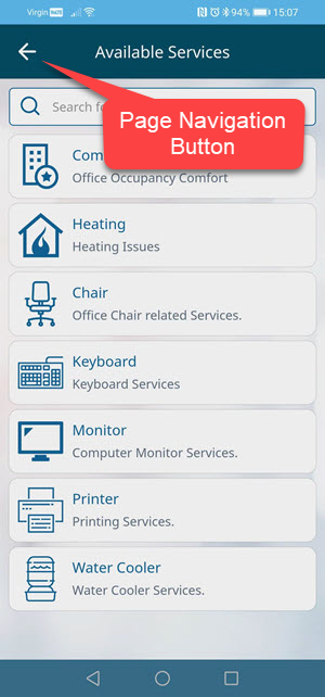
You can add a button in the layout to be rendered at the top-left of the page header.
- When configured as type Link ,the Redirect option may be set to refresh the page, go to the previous page, or go to another page in the application.
- When configured as type JavaScript, the On Click option may be set to call a JavaScript function.
Other options set the button text and appearance, and the button colour or image displayed depending on state: Up, Down, Hover.
A typical use is to add a Back button to a page, for example:

To configure a Back button like this:
- Set Enable to True.
- Set Type to Link.
- Set Redirect to Go to previous form.
- Set Transparent to On. This hides the default button allowing just an image to be displayed.
- Set an image for Up State. Optionally, for Hover State, set the same image in another colour to animate the link.
Mobile page header
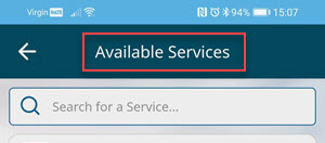
Use this option to add text to the page header of mobile screens, for example:

Note | You must set Font Size.
The Application Logo will default to being displayed on every page but can be hidden by setting the Show logo property to False on a page by page basis.